Pictures that hold up to a thirty-second look and a thirty-minute one.
Interactive tools and diagrams I’ve built to show the logic of the machine — the flows, the money, the tensions between stakeholders. Most start as a question I couldn’t answer with words alone. They scatter across LinkedIn; this is where they live together — each grouped with its kin and the essay it belongs to.
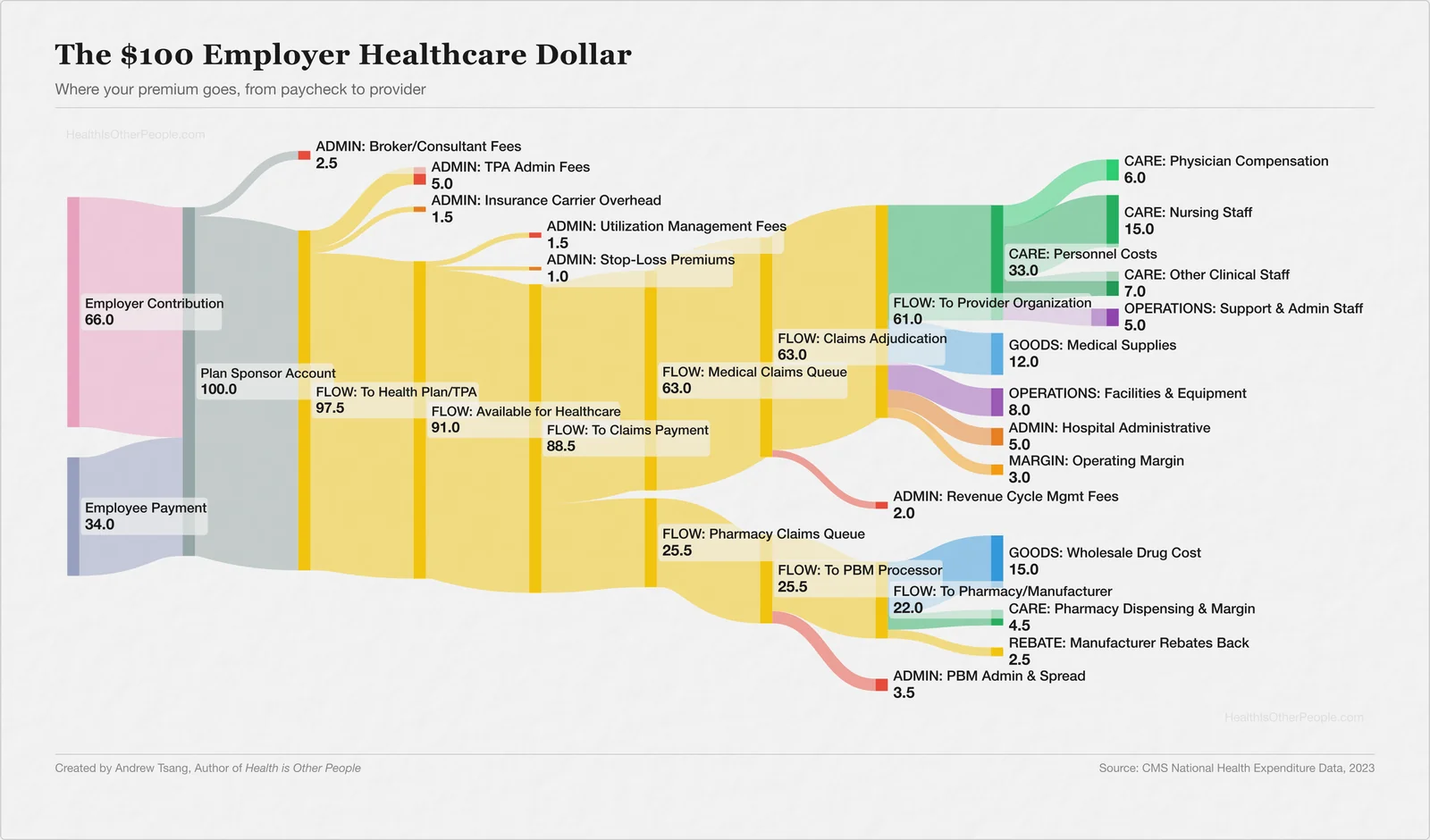
Who Decides Where Your Premium Goes?
Last year I traced $100 of my employer health insurance premium to see where it actually goes. Roughly $16.50 of every $100 goes to administrative processing before a dollar reaches anything clinical. I went in looking for a villain — instead I found a chain of answers to the same question: who decides what the money is for?
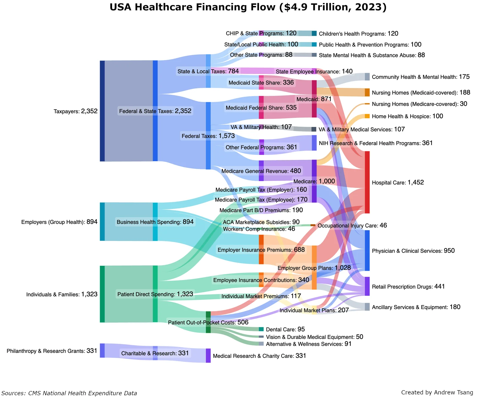
The United States — $4.9 Trillion
From a distance, US healthcare looks like an impossible maze — a Gordian knot to be cut through. But zoom in and the diagram becomes something else: these flows represent $4.9 trillion, but they also trace every medical decision made in America last year. Every dose, every diagnosis.
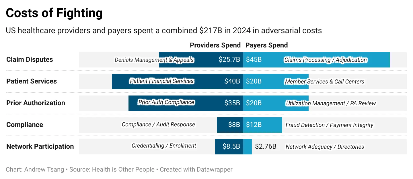
The $217 Billion Argument
I've spent my career helping both sides of a $217 billion argument. Providers and payers spent a combined $217B in 2024 fighting each other — one side denies, the other appeals.
How to Read a Public Standoff
When a hospital and an insurer go to war publicly, there's a script. Here's how to read it.
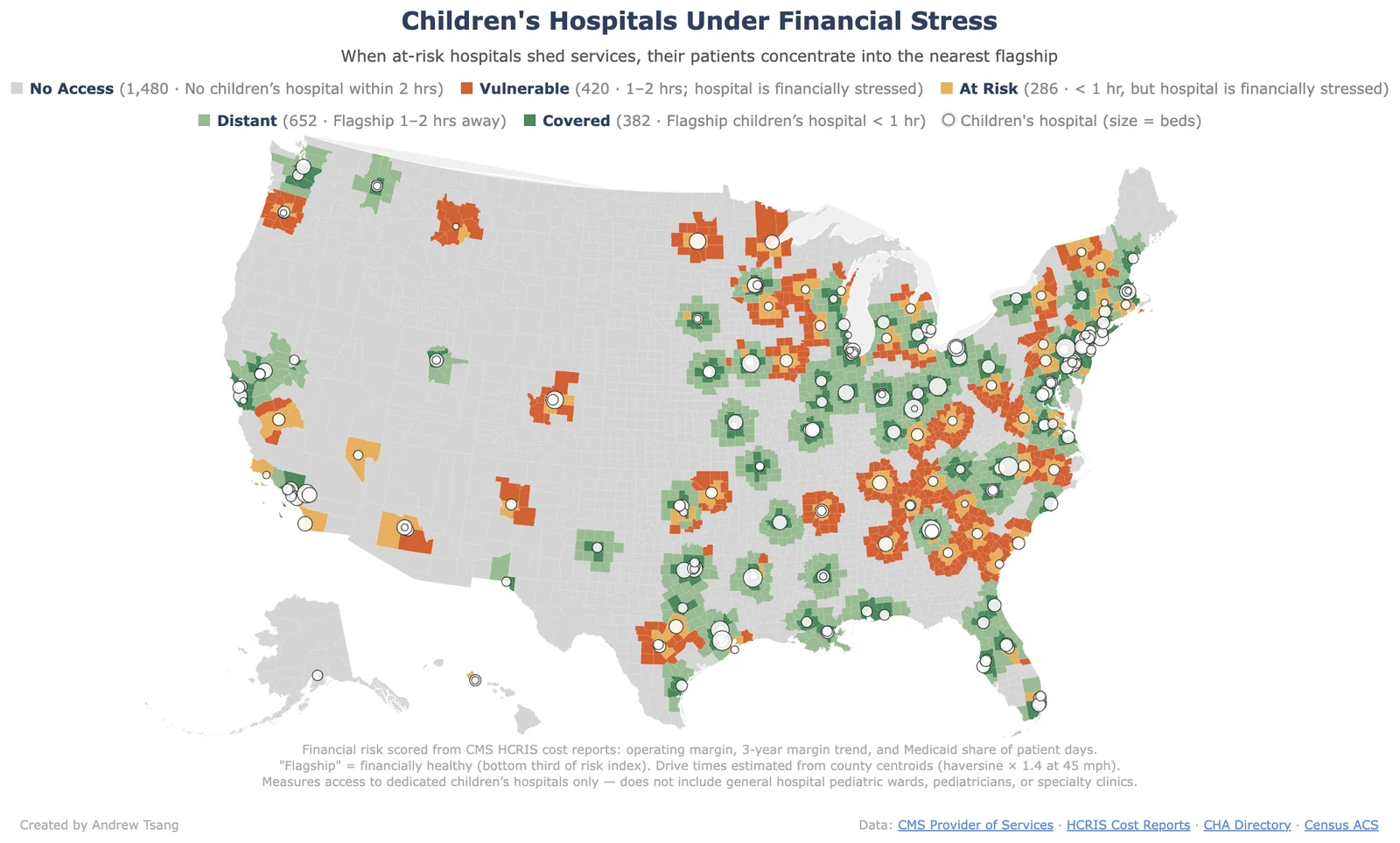
Children's Hospitals Under Stress
Children's hospitals are facing a financial crisis unlike anything they've seen — and it's not evenly distributed. When at-risk hospitals shed services, their patients concentrate into the nearest flagship.
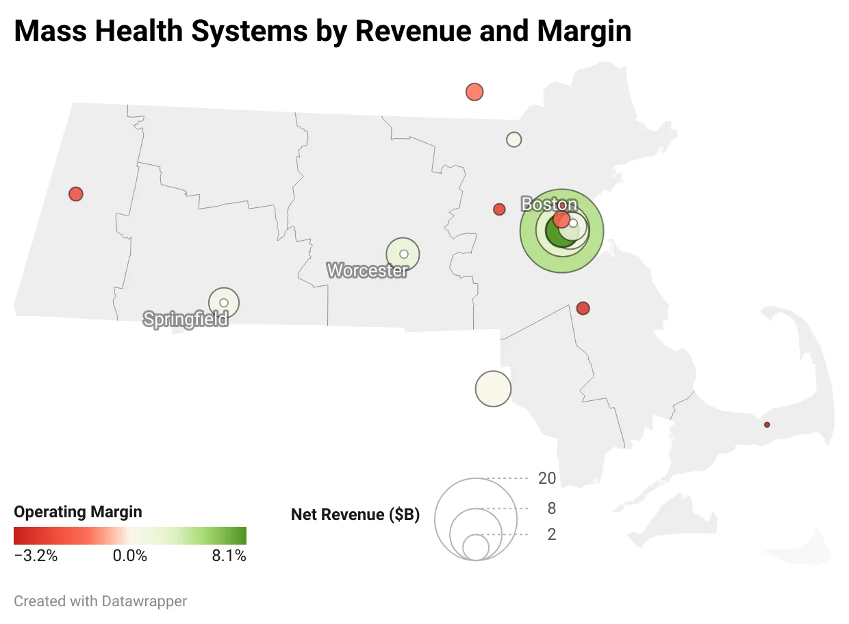
Boston's Gravity
Boston has arguably the best healthcare in the world. But that same excellence sucks in everything else in its orbit.
The Revenue Cycle, animated
I built an interactive revenue cycle map — every station, every handoff, every decision point. Then I layered the regulations on top, so you can see where each rule actually lands.
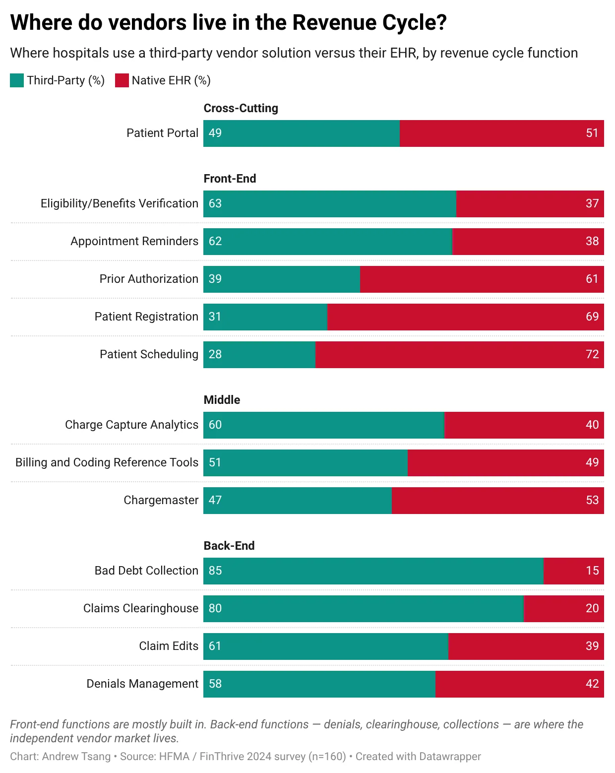
Where Vendors Live in the Revenue Cycle
The vendor market has exploded — hundreds of companies promising to fix the same broken system. So I mapped where they actually sit: which functions hospitals hand to a third party, and which stay in the EHR.
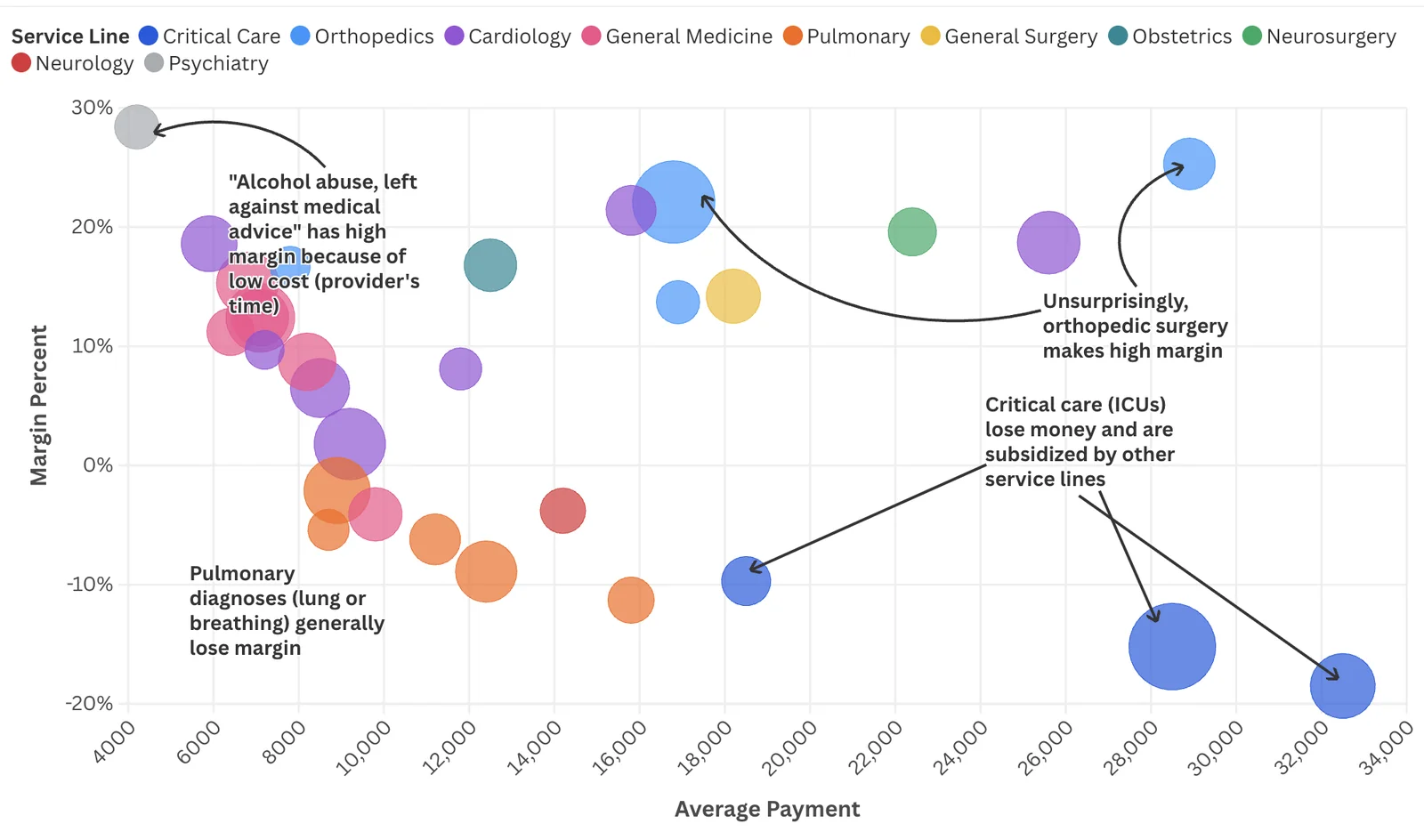
The DRG Profit Map
Some DRGs are profit engines. Others are structural losses hospitals absorb to stay in the game.
The Five-Way Seesaw
I built an interactive simulator that lets you test healthcare scenarios before they become trillion-dollar policy experiments — Medicare for All, telehealth expansion, drug pricing reform.
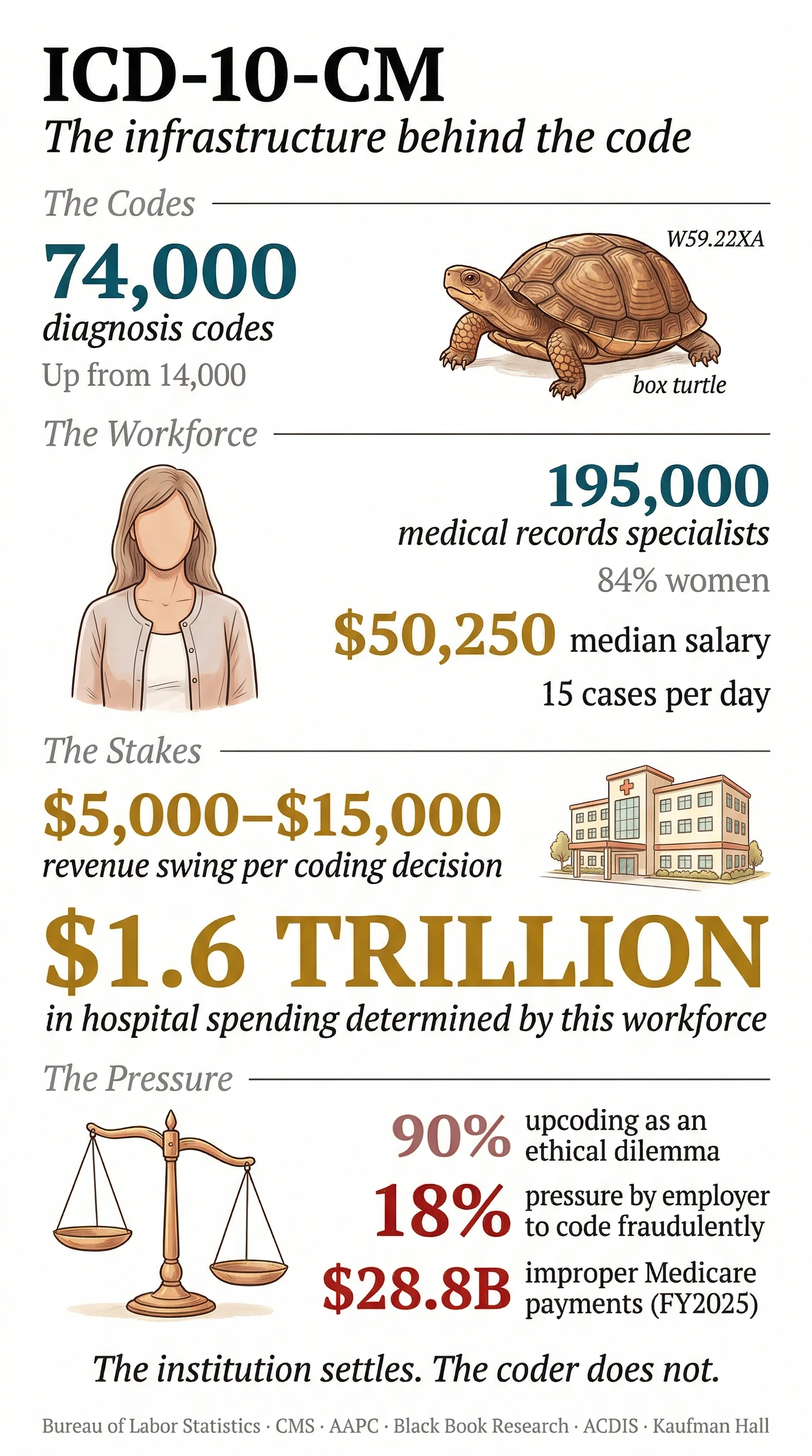 Open the full infographic ↗
The 74,000 Medical Codes
There is a medical code for being struck by a turtle. W59.22XA. There are 74,000 of these codes, and 195,000 people work inside that taxonomy.
 Open the full infographic ↗
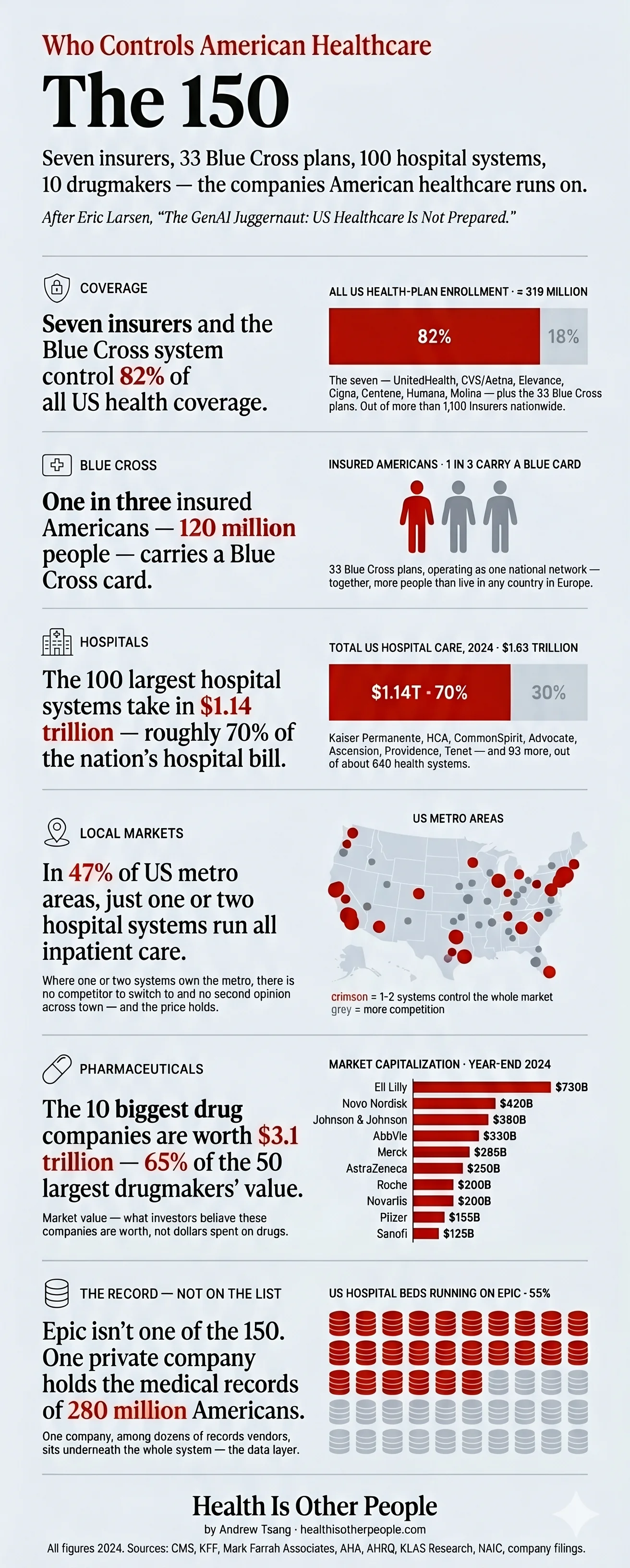
The 150 Who Run It
150 CEOs effectively control the financial architecture of US healthcare. Here's the map.
Who's Talking About What in Healthcare
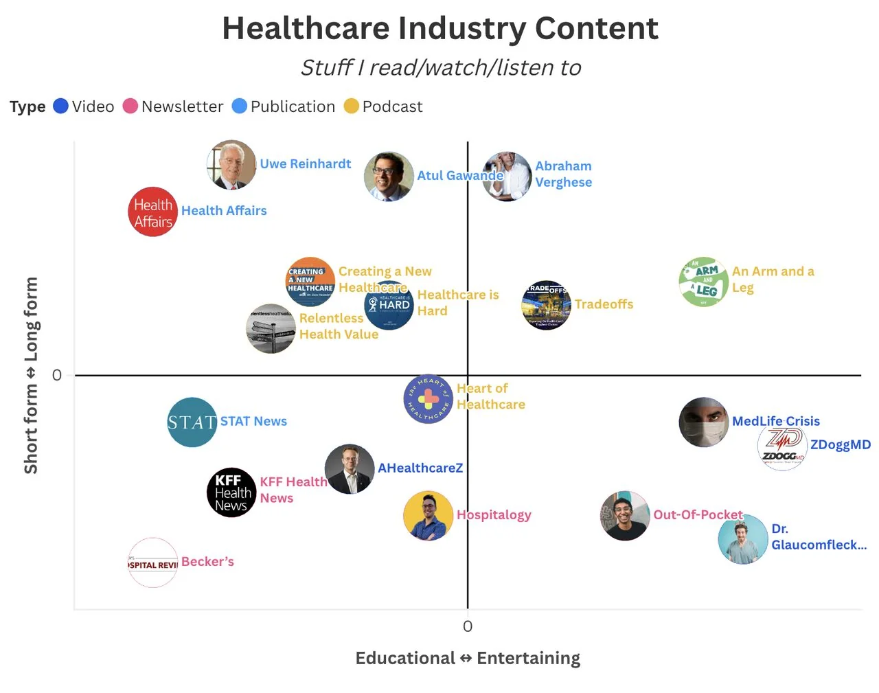
I mapped 1,000+ pieces of healthcare content to see who talks about what — and who's missing the conversation.
Most of these started as a post and still get passed around on LinkedIn. New ones tend to show up there first.